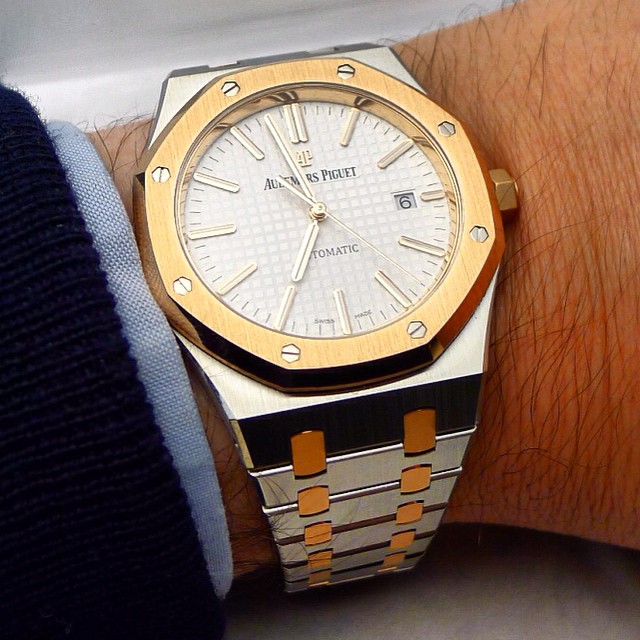
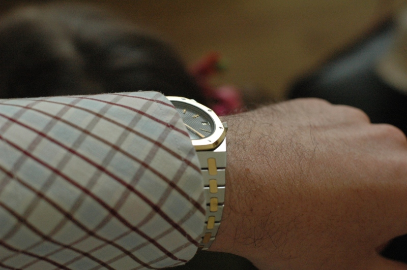
Here is the watch on my wrist:

What do you think about this version? Do you like this two tones approach of the Royal Oak which of course, has been seen many times in the past? Don’t you feel a kind of come back of the two-tones trend in the watch industry?
I would be happy to read your inputs!
Thanks a lot.
Fx
.. but this would surely stand out on your wrist. Really not bad at all. Sometimes 15400 gives impression being inferior to 15202, but this one would eliminate such impression. Nice variation, I think.
Thanks for the well taken pic, Fx!
KenNo message body
…and this one doesn’t change my mind.
It’s not the fault of the watch. I know many people like the two-tone look; but it’s not for me.
On the RO in particular, the two-tone effect seems to move a young, sporty piece (all stainless steel) into middle aged insecurity. Oddly, I don’t have the same feeling for the all-gold pieces.
Cheers,
John
Maybe it is the reason why I prefer full gold watches!
Fx
The Royal Oak reference 15400 is undeniably modern, and using the two-tone approach on this model appears successful. I look forward to trying this one in person.At least for a presentation?
Fx
This message has been edited by amanico on 2015-02-05 22:28:09 No message bodytwo tone is fine but with some more exotic materials,tantalum and rose would be my favourite for example….
Always in the 15202 variation though….15400 is too big for me…this version in 15202 would be better even if not 100% convinced…
MoThe size and thickness of the 15400 make it less appropriate for this kind of stylistic approach…
Thanks.
Fx
But your photo Fx makes this one looks nice too!Have to see it in the metal 
CheersRobinNo message bodyHere’s some pix from some years ago of an 4100SA… I LOVE the two tone AP RO… I’m always tempted to return to it!!
Howver, this model, what I don’t like about the design is that the hour indexes are so darn close to the bezel ring.. Its bad design in my opinion…besides that, I like it.
Thanks for posting!S
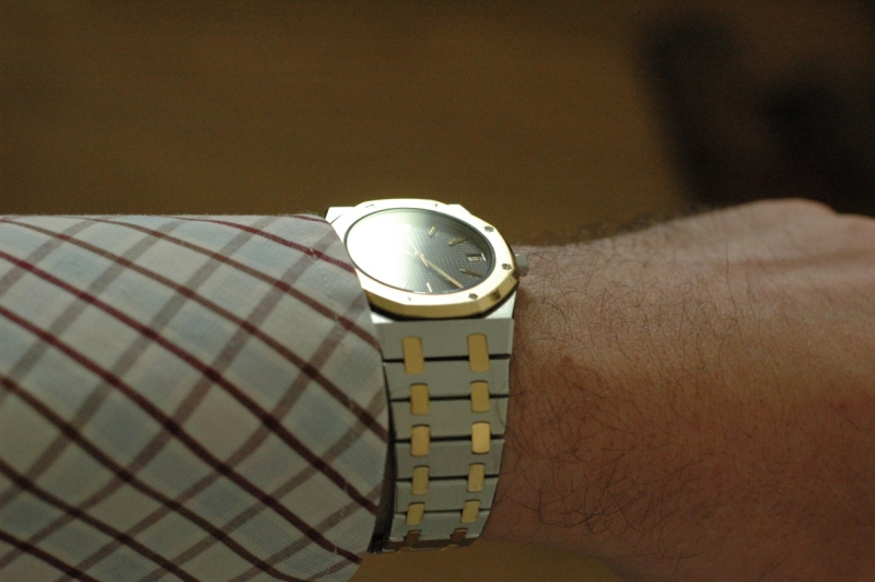
They show better the charm of two tones watches. I’m usually not a fan of them but the way the colours mix together can be very charming.
Fx
…my cup of tea…sorry.
stere
To be frank with you, I’m a SS or a full gold guy but two tones are usually not my cup of tea.
Fx
but in pics, including the official press photos, the contrast is too stark, not complementary.
I think two tone works better on the Nautilus…
Great pics, Robin!No message body

